DancheongStudio
Entry 12 / 12
Dancheong Ornament
단청 · dancheong
'Red and blue' — the painted skin of palace and temple timber, protection turned into a language of rank.
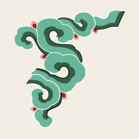
Dancheong literally means 'red and blue' and names the painted decoration that covers the wooden members of Korean palaces, temples, gates and pavilions. It began as protection: mineral pigments in glue sealed the timber against rain, sun and insects and hid the knots and joints. It became a language of status — the more layers of colour and pattern on a building, the higher its rank — and of religion, the temple hall painted as a paradise.
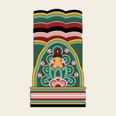
The palette is the five directional colours (obangsaek): blue, red, yellow, white and black, mixed into graded tints and separated by fine white lines. Styles range from plain ochre (gachil) through outlined (geutgi) and moro dancheong, where lotus-and-pomegranate 'head' motifs (meoricho) sit at the ends of beams, to geum dancheong, in which every surface carries brocade-like pattern. Its painters, dancheongjang, are recognised as a National Intangible Cultural Heritage.
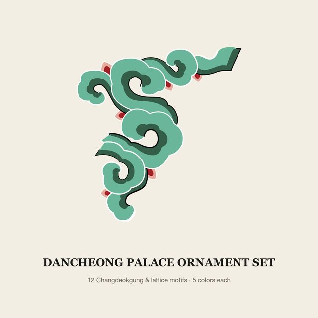
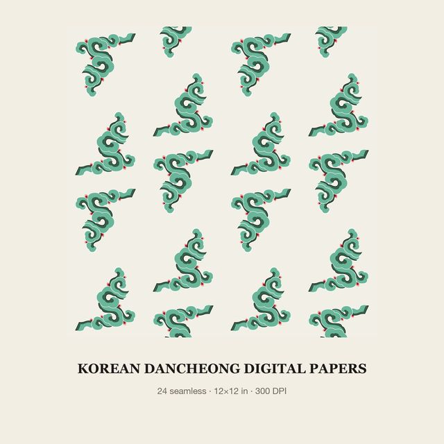
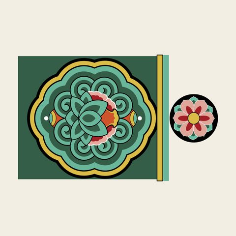
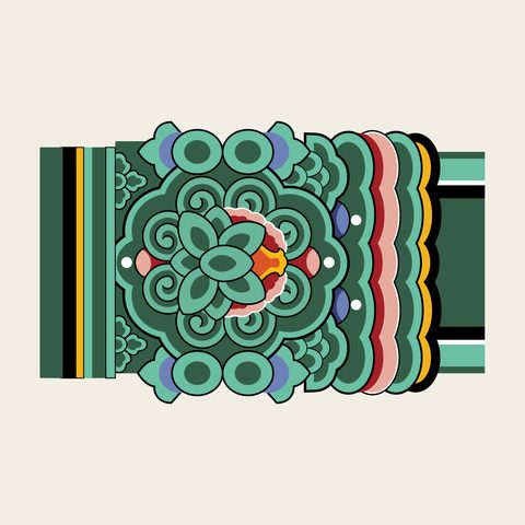
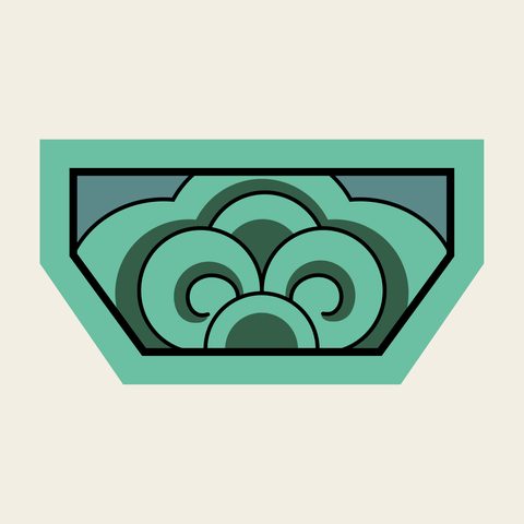
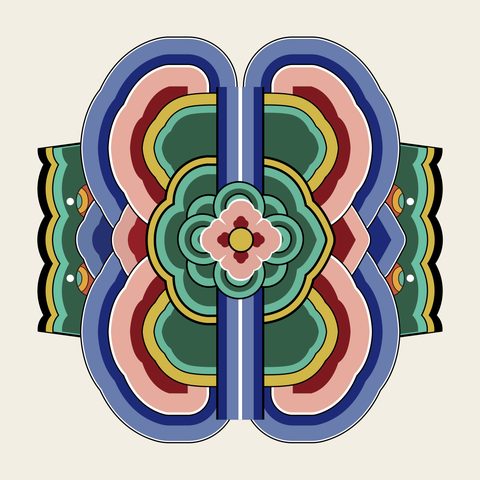
The dancheong vectors in Vol.01 were traced from published Korea Heritage Service drawings of Changdeokgung Palace: a beam-end cloud corner from Juhamnu, rafter ends, beam bands, a bracket, and the lintel and hanging-board ornaments of Eosumun and Jinseonmun gates. They are coloured as on the buildings and also supplied in four flat recolourings.
Vector examples
From the packs
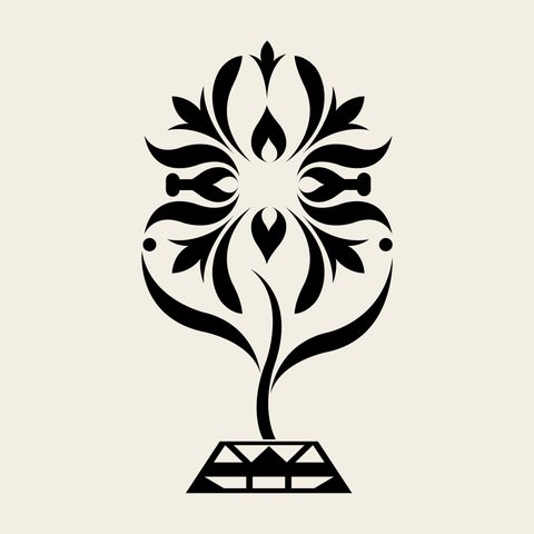
Original colours on a cream ground. Labels give the working name, the source title and number in the national archive, and the pack.

Get the vectors